


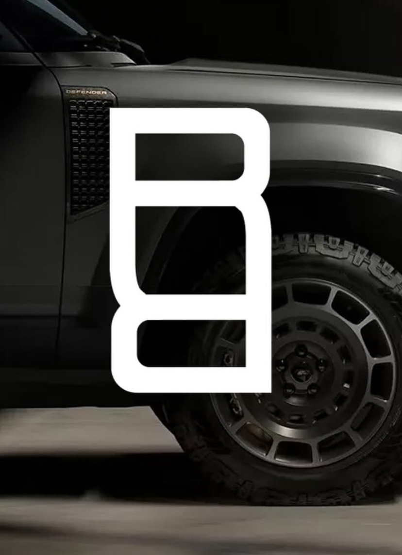
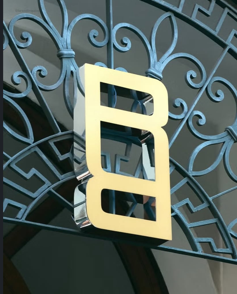
Range Rover has introduced an official logomark a bold move for the luxury SUV brand.
The new symbol features two mirrored “R” letters stacked on top of each other. It’s not replacing the classic wordmark, but will be used alongside it on labels, digital content, merch, and more.
Jaguar Land Rover says the logomark was designed for situations where the full “Range Rover” name doesn’t fit. It offers more flexibility especially as the brand heads into the EV era.
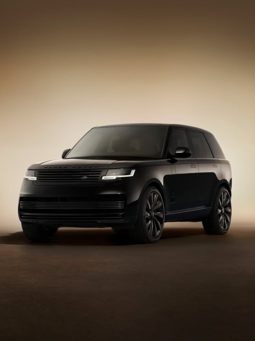
Range Rover’s first fully electric SUV is set to launch later this year. Over 60,000 people are already on the waitlist.
The new R symbol was revealed at Milan Design Week in gold and black versions. There’s also a repeating pattern version using the Rs, which could appear on seats, packaging, or apparel.
Despite the change, the full “Range Rover” wordmark and the green Land Rover oval will remain on vehicles.
Some fans love the new look. Others think it’s too different. But either way, it shows Range Rover is evolving and adapting to the future.


